What we changed
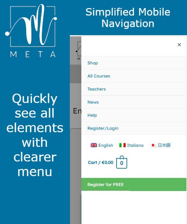
Main navigation in the header (top of the page) has been updated for better usability, especially on mobile.
We found that the mobile navigation was unnecessarily complicated, so we worked to simply it.
On desktop, we changed the colours, separated the language switcher and a small animation when mouse-over the menu items.
We also cleaned the footer (bottom of the pages) to make it clearer and more readable.

Why we changed the design/layout
We always try to improve and found that the previous navigation layout could be tricky to use… small buttons, many clicks, etc.
We want our customers to get the best experience and navigate around the site easily.
If you have any feedback, please leave a comment, we always appreciate your comments.